Wednesday, December 31, 2014

Work In Progress: Savannah, Update 2


Work In Progress: Savannah, Update 2

This has been a very busy week and very little artwork. The holidays, new grandchildren, enjoyable visits from relatives – it’s all been wonderful. I also will be holding some classes on colored pencil drawing this spring at a local art gallery and planning for that has taken some of my time. I was also approached to do a fiftieth wedding anniversary portrait for a couple, so some preparation and discussions took place relative to that. That is a project which may be started in the near future and one I look forward to.
In the first update I blocked in the figure and roughly indicated the features. The next step was to check all the measurements for accuracy. After that, I started refining the features and worked toward more detail. I found I had to make some changes but wasn’t too far off. Most importantly, I made an effort to keep my lines light, so erasing, when necessary, could be accomplished easily. I don’t want them to show when I begin adding tone.
            After establishing detail in the eyes, nose, mouth and ears and checking once again for accuracy, I added more detail to the clothing. I left the detail in the hair until later.
            The last step in the block-in is indicating the light and shadow areas. I don’t want to add gradations or halftones to the figure but just establish the broad area of light and dark, using just two tones – and ignore gradations for now. The single value of the shadows is laid in just darker than the paper.
            Now that the hectic pace of the holidays are receding I hope work will proceed at a faster pace. I’ll begin adding tone by “keying” the figure, that is, deciding how light or dark to make the portrait.


Wednesday, December 24, 2014

Work In Progress, Savannah, Update 1


Work In Progress: Savannah, Update 1
            It’s a bit hard getting too much done at this time of the year, what with two new grandchildren on top of an already busy holiday season. And probably most of you are too busy right now to even read a Work in Progress Update.
            But, I have gotten some work done on this portrait and I’d like to discuss the steps I’ve taken to get to this point. Doing a portrait requires attention to detail and a methodical approach. My method of choice until this portrait has been a very mechanical one, using the grid method to copy the portrait from a photo to gridded tracing paper, and then transferring that to the drawing paper. I wanted to do a portrait using a method involving more eye – brain – hand coordination, observation and knowledge of and feel for anatomical features. To me it’s a more satisfying way of creating a likeness. It sharpens the senses and develops an appreciation of anatomy. I also don’t have to worry about drawing the portrait twice and being able to transfer accurately.This way of creating a likeness is used by all artists who undertake portrait and figure drawing using sitting models. Their skill and the confidence it creates is to be admired.
            My method, then, is not new, but incorporates many of the same techniques used by artists using live models. It involves measuring angles and triangulation, making use of dividers and a triangle as well as freehand measurements. The portrait likeness is developed like any landscape, by proceeding from the general to the specific. The figure is first roughly blocked in using simple straight lines to get the general shape of the head. All curves are eliminated. Once the figure is blocked in, the rough shape is refined by adding more reference points and corners. Next, the placement of the features are roughly indicated, again through triangulation and measurement. The shading can also be roughly mapped out at this point and filled in lightly.
            After double checking angles and measurements of as many features as possible, and making adjustments, work begins on refining the features – the eyes, moth, nose and ears. After all the features are drawn in accurately, tonal work begins, modeling the figure and making it look three dimensional.
            I made a couple of copies of the original photo of Savannah, one showing the pose I plan to create, another with the size of the head I will re- create (that can be used to take measurements off) and third with the head larger so details can be seen. I chose Strathmore 300 series Bristol Vellum for the portrait and will do all the blocking in with a light touch and an HB pencil so I can erase easily when necessary.
            The first task was to lightly draw in the major axis from chin to the highest point on the head. From there, by using triangulation, I marked the furthest extents of the Savannah’s head both right and left. Again, using triangulation and the dividers, I built the shape of the head, adding more and more corners until I had the shape roughly drawn in.
            Next I drew a light centerline from the center of the chin to the top center of the forehead, dividing the face into right and left halves. Using triangulation and dividers I roughly blocked in the inner and outer extent of the eyes, the nose, the mouth and ears. I also lightly indicated shadow placement for further landmarks.
            Now that everything is roughed in and a fairly good likeness has been established, the next stage in developing Savannah’s portrait will be developing the features more accurately. The contrast on the drawing has been necessarily increased so you can see the image. The pencil sketch is really very light so construction lines, etc can be erased as the drawing progresses.
           
            I’d like to wish all a great holiday season and a healthy and prosperous new year, filled with all sorts of inspiration and creativity.


Wednesday, December 17, 2014

Work In Progress: Savannah, Update 1


There’s been a photo of my granddaughter in my files for more than a year now that I thought would make a great portrait study. Savannah is three now and wasn’t quite two at the time I took the photo. It was Easter and she and her sister and cousin were busy hunting for eggs that had been hidden about the yard. I was busy following them around, snapping pictures of them for posterity (and hoping to get a good shot that might turn into a nice painting). At one point I was trailing after Savannah as she walked around to the back of the house. She suddenly stood still and became quiet, seemingly in her own world. As she turned her head to look around, she saw me, her mouth curling ever so slightly into a barely perceptible smile. I snapped the picture. When I looked at it later I knew it make a nice portrait one day.
            Well, that day has arrived. I want to do the portrait while Savannah is still young, before her features change too much. I have thought about doing it in color, which looks great, and which is the way I normally do portraits, but I also have a soft spot for graphite renderings. They have a simplicity about them that is very appealing. Pure tones in gray. No distracting color to get in the way. So, I’m going to do the portrait in graphite.
            One of the drawbacks to graphite is the sheen nature of the medium when attempting to get darker tones. Lighter tones achieved with the harder pencils seem to turn out pretty good, but the darker B tones, when layered heavily to get really dark darks reflect light and, unless viewed from the side, become distracting – and annoying. Some artists avoid graphite altogether, instead choosing charcoal or carbon pencils. Using a combination of graphite and carbon pencils seems to be the best of both worlds. The harder pencils, 2H through 6H are capable of producing a wide range of soft skin tones, while the carbon pencils help achieve very dark tones such as shadows, dark hair and eyes. Highlights, especially on off white and toned paper, are produced with white charcoal and white pastel.
            I’ve seen some very remarkable graphite portraits done with a combination of pencils ranging from 4H to 4B with little or no sheen produced by Darrel Tank, who has an excellent website called fivepencilmethod.com. Darrel believes that the ugly sheen attendant to very dark graphite is mostly due to mashing down the tooth on textured paper with a heavy layer of graphite so it can no longer scatter light. He feels that building up layers of graphite with a light touch will preserve the tooth, scatter light and avoid sheen.
            Another fine graphite portrait artist who I admire is David Jamieson. He runs the Vitruvian Fine Art Studio (vitruvianstudio.com). David uses a range of hard pencils from 2H to 8H for fine skin tones and then 7B and 8B for darker tones such as hair and eyes and backgrounds. David avoids the graphite sheen by avoiding the darker graphite. The 7B and 8B pencils he uses are made by Staedtler and, most likely, are carbon pencils.
            Choice of paper is an important consideration also. We have a few choices in texture – rough, cold pressed, hot pressed, smooth.  And there are many good brands. The most important consideration is longevity. The paper, whatever texture, whatever brand, should be at least conservation grade, if not archival quality. But, what do these terms signify and why are they important? I never really gave it much thought, other than it is paper that will last a long time. But what does that really mean? I did a little research on the subject just to increase my knowledge and understanding. Maybe you already know all about this subject and this is old stuff for you. In that case, forgive me. But, if this is new and you’re learning something new here, we all benefit.
            Art paper is made from either wood pulp or cotton pulp. Wood pulp contains lignin, an organic chemical that forms part of the cell walls of plants. When lignin decays it releases acids which can slowly destroy the paper, causing it to yellow and become brittle. Acid free, pH neutral paper can be made from wood pulp or cotton pulp. Conservation grade paper is made from wood pulp which has had the lignin removed. It is, therefore, acid free and buffered to be neutral. Archival paper (or Museum grade paper) is made from cotton pulp and contains no lignin. It, too, is acid free and pH neutral. I’m not sure that there is a big difference in longevity between Conservation grade paper and Archival paper. Anyway, a short search online didn’t reveal a big difference. However, if you are really concerned about longevity, choose the archival papers made from cotton rather than the conservation papers made from lignin free wood pulp. Remember, though, that Archival paper is more expensive. If anyone can enlighten me on why archival paper would be better, please do.
            My next project is a pencil drawing of my granddaughter. I’ll be doing it on Strathmore 300 Bristol Vellum. I’ll be using a combination of pencils ranging from 4H to 4B, and possibly 7B or 8B carbon. There shouldn’t be too many installments to this project but it’s one I’d really like to do. I’ll post my first Update next week. Here’s the photo I’ll be doing the portrait from.

Wednesday, December 10, 2014

Work In Progress: Osprey: Lover’s Key, Florida Update 16


This painting is finished!
Most of you will see no changes to this from last week. The changes have been subtle, and that’s probably why I’ve decided that this painting is complete. I guess I could continue to tinker with it – for who knows how long. But, when I get to this stage, where any changes I make don’t really have an effect on the appearance, it’s done. I added a bit of color here and there, filled in some darks, sharpened up some edges.
I also added some more paynes grey to the sky, darkening it a bit here and there and defining the edges of some of the clouds. I didn’t go further because I didn’t want the sky to become more important and attract notice. It’s a supporting element.
So, the painting will have to stand as it is.

In addition to working through this painting I’ve been busy on other projects this holiday season. In addition to helping decorate the house I’ve completely re-finished a dresser for my daughter, who, by the way, is due to deliver twins tomorrow! It seems like last week when she announced she was going to become a mother once again. Now the time has arrived. The family will be quite busy over the next few days with the new arrivals.

I’ve got some ideas for my next project and am working through narrowing it down. I never lack ideas. There’s a snow scene in mind, a portrait and a landscape high on the list. Next week I’ll present my next project. 


Wednesday, December 3, 2014

Work In Progress: Osprey: Lover’s Key, Florida Update 15


            The birds and background are now nearly finished. I always leave room for additional touchups and changes. All objects in the painting relate to each other in tone, color and detail. Bringing one area of the painting to a certain stage of completion may change the relationship of another area. What I try to do is bring each object to what I think is about 90% - 95% completion, then look at all the objects in relation to one another to see if any objects need additional work. Some objects may need to be darkened or dulled, or need more color, or need more detail. I just look around and see what hits me. I walk away a lot of time and do something else. Then I’ll walk up on the painting and just look at it as a whole to see if any areas jump out as needing some additional work. Then I’ll sit down and attend to that area while the vision is still clear. When it fades I’ll walk away again and come back a few hours later and do the same thing. Little by little I hope to bring all areas into a unified, mutually supportive whole.
            In this update I’ve brought the foliage up to the same stage of completion. The foliage on the left side is in mist, so there is little definition and detail. I used a combination of Faber Castells (FC), olive green yellowish predominantly, as well as white, and cream, with some cadmium yellow and Prismacolor chartreuse for the highlights.
All the foliage on the right, under the nest was re-drawn. Rather than just draw in a jumble of foliage without any pattern, I lightly indicated branches, then added foliage to them. Here I used FC colors white, dark sepia, burnt umber, raw umber, olive green yellowish, and Prismacolor chartreuse and yellow ochre. I wanted the very bottom to fade into dark, while leaving the more detailed and more highlighted leaves up closer to the nest.
After completing the foliage I’ll be checking back often, getting an immediate impression of the whole, to see if the foliage needs more work – or if I need to alter the colors or definition or value. I don’t want the foliage to compete with the birds. So, I may dull the foliage more.
I also did some work on the fish. Here, dark sepia FC, olive green yellowish FC and some white FC to blend in the green, as it transitions to the underside, were added.
The painting is nearing completion now. I think the background needs a bit more work. I may add more definition to the clouds – and a little more drama. 


Wednesday, November 26, 2014

Work in Progress, Osprey: Lover's Key, Florida. Update 14


Work In Progress: Osprey: Lover’s Key, Florida Update 14
            I’m pleased that over the past week I found enough time to complete the birds in the nest. 
            The first task was to re-draw the birds. All the previous work on the nest had erased much of the details. The intricate pattern of the feathers on the female in the nest had to be reconstructed to make it realistic and so I had to take the time to draw the correct pattern.
            Once the birds were re-drawn I started in with the color on the head of the female. Using a very sharp point (and keeping it sharp) I penciled in the beak using dark sepia FC. I also used warm grey II and III, along with a bit of cloud blue on the upper part of the beak where light would cause some dull highlights. Throughout this coloring process I kept reference photos handy to get the anatomy right on the head, penciling in the details of the nostril and beak where it attaches to the head. I also used a sharp point on black FC to color in the black eye ring and pupil. The iris is pumpkin orange with cadmium yellow FC. The cadmium yellow in the iris highlights the interior of the eye, giving it a three dimensional, glowing appearance as the sun catches its edge. One thing I did wrong here was to color in the pupil first. I should have colored in the iris first. By coloring in the pupil first I had to be extra careful not to drag some black into the iris. Coloring in the lighter iris first would have made it easier to keep a sharp edge to the pupil. I was a bit over anxious to get the pupil in.
            After getting the eye in I worked the rest of the head and then the body. The wing and back feathers were colored in with raw umber FC, burnt umber FC, dark sepia FC, cream and black FC. The raw umber and cream were used to produce the highlighted areas on the feathers on the back and the parts of the wing caught by the light. Dark sepia FC, burnt umber FC and black FC, with some raw umber FC was used on the rest of the wing feathers, grading darker and darker as it wrapped around the body and away from the sunlight. I was careful to leave white here and there to show the edges of the feathers. The breast was a combination of warm grey I and II FC, French grey 30%, 50% and 70%. I also added some cloud blue to the shading mix.
            This didn’t go as smoothly as I suggest here because somewhere in the middle I realized that I had lost the pattern of the feathers on the wing. Although there is some variation in size and the pattern isn’t rigid, there is an order to the feathers. When coloring in the individual feathers I strayed from the correct pattern and had to go back over it and straighten it out. So, when coloring in wing feathers, don’t get so engrossed with the coloring that you lose sight of the pattern.
            After completing the female I used the same colors to finish up the two chicks.
            Now that the birds are pretty much completed, I’ll move on to the foliage at the bottom. 


Wednesday, November 19, 2014

Work In Progress: Osprey: Lover’s Key, Florida Update 13


The nest is complete. Except for some adjustments here and there later on, based on the rest of the composition. As always, I like to bring each element to a point I’m satisfied with, then continue on with other elements. As I work through each element, I look back at all the elements I’ve worked on and look at them again in relation to the whole. If I think some element needs more work or needs to be altered in some way, I will do that right then or make a mental note to go back to it at a future date. When I get to a point where I feel any touchups won’t add to the composition, I call it finished. At this point, I’m pretty happy with the nest and I’m going to move on to the birds in the nest.
            Elements that may still be in flux are the sky background, which could possibly do with a bit more detail in the clouds, and the lower left corner, which, in the drawing has some foliage and branches shrouded in mist. I haven’t decided whether to keep that in or forget it as unnecessary.
            Next week I’ll have a good bit of the birds in the nest completed. The painting is nearing completion.


Wednesday, November 12, 2014

Work In Progress: Osprey: Lover’s Key, Florida Update 12


            I’ve been fortunate this past week to have had enough time to make some progress on this painting. As promised, I began work on the nest. There’s a lot to it, a lot of inter-woven branches going this way and that. Some diving deep into the mass, others poking out and away. All of it tangled – but very well constructed and suited to the task of protecting eggs and eventually young chicks. Ospreys use their nests year after year, making repairs as necessary. They build nests on manmade structure such as telephone poles and special platforms constructed just for that purpose. These platforms have been instrumental in helping to re-establish Ospreys after steep declines in their populations due to DDT use in the early 1900’s. DDT was banned in the 1970’s and Osprey populations began to re-build.
            The nests are built out of stick, vines, bark and anything else the birds can find. Usually the male brings all the materials and the female builds the nest. The nests start out at about 2 and one half feet in diameter and six inches deep, but can increase in size to nearly 12 feet deep and up to 6 feet wide after years of use and additions.
            My first task was to fill in all the darkest areas, and in doing so, give some three dimensional form to the nest. I used dark sepia FC and burnt umber FC over all of the left side of the nest, the part in shade, as per the tonal drawing. Next, I filled in all the deepest recesses between the twigs and branches using the same two colors. The darks wrapped around the bottom of the nest also and in doing so, defined the masses of foliage in front. As I worked toward the right side I filled in only the deepest areas because the sunlight is impacting this side more. Using additional colors (warm greys I and II, raw umber, cream, white, raw ochre, black) I started to give form to the myriad branches that formed the nest.
I’ll continue with these colors, working each of the twigs and branches, giving them three dimensional form and adding cracks, splits, little worm holes and whatever to make them realistic looking. It seems to be subjective exercise, working on each branch, darkening here, sharpening there, adding highlights and deepening shadows until it feels right.

Wednesday, November 5, 2014

Work In Progress: Osprey: Lover’s Key, Florida Update 11


            I continued work on the Osprey in flight this past week, completing the outstretched left wing.
            For a seemingly near monotone structure, I used a surprisingly large number of colors. The list includes dark sepia FC, warm grey I and II FC, French grey 50%, 70% and 90%, raw umber FC, burnt umber FC and white FC. They all had their places but it is possible that I could have done it with a shorter list. I just grabbed what I thought would look right at a particular moment. The feathers are not just black and white striped or grey and white striped but vary subtly depending on how the light strikes them. Some light umber shows as highlights when the light hits the feather right. The feathers are turned this way and that as the wind catches them and the bird moves them up and down in the air. The feathers are not completely flat either. There can be a slight bending on either side of the central shaft or rachis. So, the light will be caught differently on either side. You can see that in some of the feathers, where one side of the shaft is lighter than the other. I also hinted at the striated nature of the vane, the barbs running out from the shaft, especially in the primary feathers. I did this by first coloring in the vane with a bit of raw umber, then filling in the vane with lines of dark sepia. I needed to keep a very sharp point on the pencil.
            The bird in flight is now pretty much completed but I may have to make some changes to tones on the bird as I progress through. Everything is relative to everything else, so, as I progress through, I look at each element and make changes in tone here and there until I think all the parts look right relative to one another.
            I think next I’ll be starting on the nest. 


Wednesday, October 29, 2014

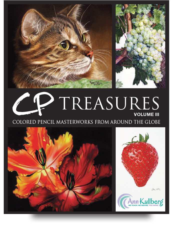
CP Treasures, Volume III is available for purchase now and will be shipping November 18. It is a beautiful collection on some of the best colored pencil art in the world. I feel very honored to have my portrait painting of my granddaughters included in this Collection, and to be counted among so many incredibly talented artists.


 If you are a colored pencil artist, interested in colored pencil paintings or just want to have a copy of this book for inspiration and reference go to this link: http://annkullberg.com/collections/books-more . I know the artwork will inspire me!

Tuesday, October 28, 2014

Work In Progress: Osprey: Lover’s Key, Florida Update 10


            Last week I got a good start on the Osprey in flight. Much of the right wing and the head were completed (or nearly so, since I usually complete 90% of an area and then go on to another, so that I can determine later if more work is necessary, based on the completeness of surrounding areas). I then started work on the body. Since the light is coming from the right side of the painting, I started shading the right side of the bird (the side away from the light. Here I used a combination of french greys, 10% and 30%, as well as FC warm grey I and cloud blue, layering them slowly until I felt I was close to what I wanted. I also used FC white to help blend them and make the transition to the whitest white (the color of the paper).
            The legs then came next. Using the same colors I worked in the shadows and developed the form. The area just above the feet is nearly devoid of feathers, so the rough skin texture becomes more visible. The same is true of the toes. There are a lot of creases and wrinkles. Here I used a very sharp HB lead in a mechanical pencil to work in more detail. The talons were drawn in with FC dark sepia and reinforced with HB lead.
            Since I was working on the feet I decided to do a little work on the fish – just enough to give the feel of it in the bird’s grasp.
            After both legs and feet were complete I went to work on the tail. The tail is in part shade and part bright light. The shaded part on the bird’s right side only caught light here and there but as feathers transitioned to the bird’s left, they caught more light. So more grey was added on the bird’s right and more of the paper showed through on the bird’s left. I left shadows as well as highlights on the feather shafts. Here and there where the light affected the feathers I added raw umber.
            All that’s left now is the bird’s left wing, outstretched, all of the underside visible. The first order of work here was to work out the pattern of darks in the feathers. Once I have that laid out, I’ll go back and finish it, filling in the details. 


Thursday, October 23, 2014

Work In Progress: Osprey: Lover’s Key, Florida Update 9


            My apologies for not having posted this on schedule. My wife and I have just returned from a short vacation – visit in Virginia, and it lasted a bit longer than expected (it’s hard to turn back from the mountains). We spent some time visiting our son there and then visited a few historic homes of founders of this republic, as well as areas of natural beauty. It was a trip well spent.

            I was even able to make some progress on the Osprey painting. With the background completed for now ( I may want to further strengthen it after completing the main features), I started on the Osprey in flight. I started on this side because I want to complete the painting from left to right to avoid having to cover parts already completed and possibly smudging them.
            The Osprey colors may, at first sight be relatively simple – black (and grey) and white – but closer observation reveals more subtleties. Shading isn’t just grey but has a bit of blue in it – a reflection of the bluish background. Blue shadows are more realistic and more interesting. The dark feathers aren’t just black but also have other subtle colors depending how the light hits them. So, the colors I am going to use on this bird are:
                        Prismacolor
                                    Blue slate
                                    Cloud blue
                                    Light umber
                                    French grey 90%
                                    Warm grey 30%
                        Faber-Castell
                                    Dark sepia
                                    Burnt umber
                                    Light ochre
                                    Warm grey I
                                    Warm grey II
                                    White
            Seems like a lot, but they are all necessary to attain the effect. The dark feathers were the result of using dark sepia, French grey 90% and burnt umber. Highlighted areas were accomplished with light umber and light ochre.
            All the whitish areas of the feathers were accomplished with combinations of the greys and white. Even some light umber was used in the lighter banding of the feathers. Of course, blue was added to the greys in the shadow areas to bring even the shadows to life. The light is coming from the right side, so areas such as the side of the bird’s head and body are in some shadow. The detail pictures show more of these shadows.
            The eye was completed with very sharp points to get as much clarity as possible. Yellow ochre surrounds the black pupil. And, I’ve left a small light highlight on the pupil where the light strikes it. He is looking intently down toward his charges in the nest.

            I’m going to continue working on this bird and hopefully have much more completed by next week.


Wednesday, October 15, 2014

Work In Progress: Osprey: Lover’s Key, Florida Update 8


Work In Progress: Osprey: Lover’s Key, Florida Update 8

            Now that all the preliminary preparations are complete, I’m ready to start painting the scene.
            Since the background will be watercolor, and I wanted the freedom to brush across the paper without having to worry about the birds or the nest getting in the way and having to work around them. So, I masked off all but the background with a combination of masking fluid, paper and tape. First, I cut pieces of paper out large enough to fit inside the objects to be masked so I wouldn’t have to paint masking fluid over the whole bird or nest. I then taped them down. I used masking fluid around all the outer edges of the birds and nest, making sure to paint up onto the tape to seal it.
            Finally, I can paint. After all the preliminary work, I’m anxious to get started. I mixed up a good amount of paynes grey to do the background. Next, I wet down the entire area to be painted with water, giving it two coats. Then, I painted wet in wet, building up a number of layers, adding more layers in some spots than others to suggest clouds here and there as I went. When I felt it was dark enough I stopped. I didn’t want to add any more detail to the clouds now. Once the birds and nest are in I can decide if more work is necessary on the background. Since it’s not a good idea to leave the masking fluid in place more than a day or so, I wanted to mask the paper, paint in the background and remove the masking all the same day.
            The photos show the progression from drawing to masking to painted background. Next, I’ll start with colored pencil on the bird in fight.


Wednesday, October 8, 2014

Work In Progress: Osprey: Lover’s Key, Florida Update 7


            This past week I did manage to make some progress on the Osprey painting.
The next step in the process is to develop the colors to be used. This painting will be mixed media – colored pencil and watercolor. Watercolor will be used for the background and colored pencil for all the rest.
I had two options for the background. I wanted to keep some misty clouds in it but wasn’t sure if I should have clouds mixed with blue sky or all clouds with a subdued gray-blue tone. Sort of a cloudy day. So I tried both approaches. In both cases I kept the colors of the birds and nest the same, changing only the background.
In the first approach I used winsor blue in a manner to give the appearance of blue sky poking through here and there in a foggy, cloudy day.
I changed to Paynes Grey for my second approach. The intent here was to create a cloudy sky with light coming from a clearing sky toward the right.
The effects of the two colors made a big difference in the mood of each. The winsor blue gave a bright cheery effect while the paynes grey produced a more somber mood. The winsor blue background with its mixed blue and white patches interfered with the white of the flying Osprey. The paynes grey in the other sketch actually set off the bird more, making it more prominent. I could have introduced more blue into the winsor blue background to outline the bird more but I didn’t want that much blue.
In the end I decided the paynes grey background was the better of the two. The winsor blue called more attention to the sky while the paynes grey was more neutral and provided a better supporting role. It also added some drama. The focus is more on the bird.
The colors for the birds and nest were arrived at by testing colors and combinations on a separate sheet and keeping the object shapes fairly simple. The nest shows no twigs and branches in the color sketch. I was more concerned with the overall color scheme. As I work the painting I’ll be indicating the colors used.
Now that I’ve worked out the tones, composition and colors, I’ll be transferring the drawing to watercolor paper and then begin the painting. I’m using Arches 300 lb watercolor paper for the support. If all goes well I should have the background sky nearly complete by next week.


Wednesday, October 1, 2014

Work In Progress: Osprey: Lover’s Key, Florida Update 6


            This past week has been a busy one for me – and involved a lot of painting. Only the painting I was doing was not painting landscapes but painting walls, baseboards and closets. So, I didn’t accomplish nearly as much as I had hoped on the Osprey painting.
            My daughter is pregnant with twins – a boy and a girl – and, along with raising two other young and active children, running a household, and working toward a college degree in her “spare time”, she is quite busy getting everything ready for their arrival – in December. Part of that preparation involved re-painting a room which will become the twins’ upon their arrival. Since I have some expertise in painting, I volunteered to help paint the room, and spent most of last week finishing up trim and baseboard, painting along the ceiling, around windows and inside a closet. To make matters worse, the previous color was so dark that it took four coats of fresh paint to fully cover it.
            Needless to say, family matters and responsibilities trump all others. I was happy to help, and do my part to make my daughter’s life a bit easier. She and her mother spent much of the weekend gathering material to make truly unique curtains for the room.
As a result, I wasn’t able to make much progress on the Osprey. I had hoped to have the color sketches finished by today but failed in that regard. I have made a dent in it and will be posting them as soon as possible. At any event, they will be posted by mid week next week, on my usual day

Wednesday, September 24, 2014

Work In Progress: Osprey: Lover’s Key, Florida Update 5


            Last week I discussed how, from the thumbnail sketches, I arrived at a composition of an Osprey in flight, returning to his nest, where hungry mouths were waiting.
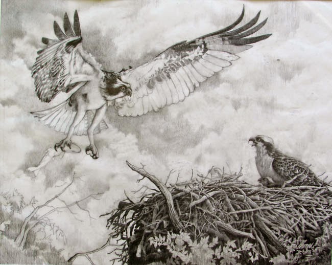
I tried out some value sketches and picked one that I thought would make a good painting. But, rather than launch right into the painting, I decided to work up a full size graphite drawing. In this way I could see how the background clouds would look full size. I could work out the pattern in detail to see if the vague image in my mind’s eye would look good in real.
            In addition, I wanted to work out the detailed structure of the nest so I didn’t have to try to work it out on the final paper. The values also were very important, so I wanted to be sure the values and their relationships were what I wanted.
            The final reason for working up a full size pencil drawing was to decide on the final size. I jumped back and forth on that a bit but after consulting with my wife and daughter, who were following the progress closely, I decided to enlarge it a bit from the 20” by 16” to 22” X 17”. Both my wife and daughter felt it would be better to include all of the tail of the mama bird in the nest, rather than cut it off. I had to agree. Any opinions out there?
            So, here is the final pencil drawing.
            I’ll have to work out the colors scheme for the background, the birds and the nest. That will be presented in the next update. From that final preparation step I’ll begin to work up the painting. At this point I’m still confident that I’ll do a watercolor background with colored pencil for the birds, nest and foliage. I’m considering working this pencil drawing into a finished form that could be made into prints. 


Wednesday, September 17, 2014

Portrait of Raine and Megan accepted into Colored Pencil Treasures

I was very pleased to hear that one of my colored pencil paintings has been accepted for publication in Colored Pencil Treasures, Volume III. Ann Kullberg, one of the finest colored pencil portrait artists in the world, and publisher of Colored Pencil Magazine, sponsored the competition. If you'd like to visit her website, it's annkullberg.com. Ann hopes to have Volume III out for the holidays. The painting that was accepted was my portrait of my grandchildren, Raine and Megan.

Work In Progress: Osprey: Lover’s Key, Florida Update 4


            Now that I’ve completed the thumbnail composition and value sketches, and gotten feedback from the client, I’m ready to work up the full size pencil drawing. There are still some compositional questions for me when it comes to the final painting, though. I’m still not sure how to present the bird in the nest. Do I want some chicks, also? I want the background to be benign but I’m also thinking of some low, diffuse clouds, rather than a solid uniform color. I want to see what the background might look like with some light clouds before trying it with paint. I suggested a misty, cloudy background in one of the value thumbnails and that composition interested me.  I also want to be sure the values I worked out look good in the full size drawing. It looks more and to me that I’m going to have to produce a full size pencil drawing with a lot of detail. That will reduce surprises and uncertainties to a minimum. It’s a lot more work but I feel more comfortable with it and well worth the extra time.
            I started working up a full size composition, 28” X 19”, in pencil on tracing paper. First, I blocked in the nest area in the bottom right, along with some foliage that might be present in the upper parts of the trees. Rather than draw the bird in flight directly on that same sheet, I blocked it in on a separate sheet of tracing paper. Once I was sure of the size and shape I placed it under the tracing and moved it around until I liked the position relative to the nest. Then I retraced it onto the sheet with the nest. After that I added more detail without any shading.
            As I was drawing the bird in flight I kept comparing its size to the nest to get the relative sizes right. I found that I had to increase the size of the nest some, so I kept adding on to it.
            After getting the bird in flight to a stage I was happy with, I decided to work on the nest. There’s a great deal of detail in that nest – a great many twigs and branches inter-twinned and woven into a massive and solidly built structure. Rather than work all that out on the final good paper (and have to erase and re-work) I worked it all out in the pencil drawing. I added shading as I filled it all in to see how the lighting would play on the twigs. The light is coming from the right side and is fairly low in the sky. That will make the right side of the birds and nest (and twigs, etc) lighter. The cloudy background will eliminate strong lighting but still allow lights and darks and shadows. I wanted to see if my mind’s eye view of the scene would be equaled by my pencil work.
            Composition 1 shows a side view of the bird in the nest. In Composition 2 I tried a frontal view of the bird. I then went to a back view in Composition 3. You’ll notice the size of the nest also increases from Composition 1 to Composition 3 as I decided it had to be larger. In the end I preferred the side view of the nesting bird (Composition 1). I also decided to add two chicks to the nest. They’re barely visible above the nest but can be seen on closer observation. The final positions and poses can be seen in Composition 4. I felt that the back view presented too large a bird in the nest. It began to compete for interest. The frontal view just wasn’t all that interesting. I preferred the side view where the bird was lower and not so imposing. Its shape pointed toward the bird in the air – the center of interest. I pointed its head upward also toward the bird in flight – and it looks that way, guiding the viewer’s eyes in that direction. In Composition 4 we see the same side view but with chicks added. They also look upward toward the bird in flight. You can see in Composition 4 that the nest has been increased in width. It looks more like it can accommodate all the birds.
            Once I was sure of the placement and sizes I started to work up the pencil drawing on tracing paper. This is where I added all the detail and values. I just started adding the detail to Composition 4. As I worked this drawing up I felt the drawing was too large, that I was including much more than I need to on both sides. The original drawing was 28” X 19”. I cut out a couple of frames from white drawing paper to see how the picture would look in other sizes. I like the look of the 20” X 16” because it seems more intimate, as it focuses on the subjects. But I’m not 100% sold yet and will keep comparing the different proportions until I am. Weigh in on the sizes if you wish. What size do you prefer – and why?
            Pencil Composition 3 shows the drawing nearly finished. All the detail is complete for the nest, the mama bird in the nest and most of the bird in flight. The background sky is nearly complete also. I’m happy with the values and the lights and darks of the clouds in the background seem to help tie the bird in flight and the nest birds together. The lower left is still incomplete and I am debating how much of that to include. There is a nice diagonal composition here and I don’t want the lower left to destroy that. I may work up that corner on an overlay to see what I think.
            Next week I’ll show the completed pencil drawing. Then it’s time to start painting!