Wednesday, September 24, 2014

Work In Progress: Osprey: Lover’s Key, Florida Update 5


            Last week I discussed how, from the thumbnail sketches, I arrived at a composition of an Osprey in flight, returning to his nest, where hungry mouths were waiting.
I tried out some value sketches and picked one that I thought would make a good painting. But, rather than launch right into the painting, I decided to work up a full size graphite drawing. In this way I could see how the background clouds would look full size. I could work out the pattern in detail to see if the vague image in my mind’s eye would look good in real.
            In addition, I wanted to work out the detailed structure of the nest so I didn’t have to try to work it out on the final paper. The values also were very important, so I wanted to be sure the values and their relationships were what I wanted.
            The final reason for working up a full size pencil drawing was to decide on the final size. I jumped back and forth on that a bit but after consulting with my wife and daughter, who were following the progress closely, I decided to enlarge it a bit from the 20” by 16” to 22” X 17”. Both my wife and daughter felt it would be better to include all of the tail of the mama bird in the nest, rather than cut it off. I had to agree. Any opinions out there?
            So, here is the final pencil drawing.
            I’ll have to work out the colors scheme for the background, the birds and the nest. That will be presented in the next update. From that final preparation step I’ll begin to work up the painting. At this point I’m still confident that I’ll do a watercolor background with colored pencil for the birds, nest and foliage. I’m considering working this pencil drawing into a finished form that could be made into prints. 


Wednesday, September 17, 2014

Portrait of Raine and Megan accepted into Colored Pencil Treasures

I was very pleased to hear that one of my colored pencil paintings has been accepted for publication in Colored Pencil Treasures, Volume III. Ann Kullberg, one of the finest colored pencil portrait artists in the world, and publisher of Colored Pencil Magazine, sponsored the competition. If you'd like to visit her website, it's annkullberg.com. Ann hopes to have Volume III out for the holidays. The painting that was accepted was my portrait of my grandchildren, Raine and Megan.

Work In Progress: Osprey: Lover’s Key, Florida Update 4


            Now that I’ve completed the thumbnail composition and value sketches, and gotten feedback from the client, I’m ready to work up the full size pencil drawing. There are still some compositional questions for me when it comes to the final painting, though. I’m still not sure how to present the bird in the nest. Do I want some chicks, also? I want the background to be benign but I’m also thinking of some low, diffuse clouds, rather than a solid uniform color. I want to see what the background might look like with some light clouds before trying it with paint. I suggested a misty, cloudy background in one of the value thumbnails and that composition interested me.  I also want to be sure the values I worked out look good in the full size drawing. It looks more and to me that I’m going to have to produce a full size pencil drawing with a lot of detail. That will reduce surprises and uncertainties to a minimum. It’s a lot more work but I feel more comfortable with it and well worth the extra time.
            I started working up a full size composition, 28” X 19”, in pencil on tracing paper. First, I blocked in the nest area in the bottom right, along with some foliage that might be present in the upper parts of the trees. Rather than draw the bird in flight directly on that same sheet, I blocked it in on a separate sheet of tracing paper. Once I was sure of the size and shape I placed it under the tracing and moved it around until I liked the position relative to the nest. Then I retraced it onto the sheet with the nest. After that I added more detail without any shading.
            As I was drawing the bird in flight I kept comparing its size to the nest to get the relative sizes right. I found that I had to increase the size of the nest some, so I kept adding on to it.
            After getting the bird in flight to a stage I was happy with, I decided to work on the nest. There’s a great deal of detail in that nest – a great many twigs and branches inter-twinned and woven into a massive and solidly built structure. Rather than work all that out on the final good paper (and have to erase and re-work) I worked it all out in the pencil drawing. I added shading as I filled it all in to see how the lighting would play on the twigs. The light is coming from the right side and is fairly low in the sky. That will make the right side of the birds and nest (and twigs, etc) lighter. The cloudy background will eliminate strong lighting but still allow lights and darks and shadows. I wanted to see if my mind’s eye view of the scene would be equaled by my pencil work.
            Composition 1 shows a side view of the bird in the nest. In Composition 2 I tried a frontal view of the bird. I then went to a back view in Composition 3. You’ll notice the size of the nest also increases from Composition 1 to Composition 3 as I decided it had to be larger. In the end I preferred the side view of the nesting bird (Composition 1). I also decided to add two chicks to the nest. They’re barely visible above the nest but can be seen on closer observation. The final positions and poses can be seen in Composition 4. I felt that the back view presented too large a bird in the nest. It began to compete for interest. The frontal view just wasn’t all that interesting. I preferred the side view where the bird was lower and not so imposing. Its shape pointed toward the bird in the air – the center of interest. I pointed its head upward also toward the bird in flight – and it looks that way, guiding the viewer’s eyes in that direction. In Composition 4 we see the same side view but with chicks added. They also look upward toward the bird in flight. You can see in Composition 4 that the nest has been increased in width. It looks more like it can accommodate all the birds.
            Once I was sure of the placement and sizes I started to work up the pencil drawing on tracing paper. This is where I added all the detail and values. I just started adding the detail to Composition 4. As I worked this drawing up I felt the drawing was too large, that I was including much more than I need to on both sides. The original drawing was 28” X 19”. I cut out a couple of frames from white drawing paper to see how the picture would look in other sizes. I like the look of the 20” X 16” because it seems more intimate, as it focuses on the subjects. But I’m not 100% sold yet and will keep comparing the different proportions until I am. Weigh in on the sizes if you wish. What size do you prefer – and why?
            Pencil Composition 3 shows the drawing nearly finished. All the detail is complete for the nest, the mama bird in the nest and most of the bird in flight. The background sky is nearly complete also. I’m happy with the values and the lights and darks of the clouds in the background seem to help tie the bird in flight and the nest birds together. The lower left is still incomplete and I am debating how much of that to include. There is a nice diagonal composition here and I don’t want the lower left to destroy that. I may work up that corner on an overlay to see what I think.
            Next week I’ll show the completed pencil drawing. Then it’s time to start painting!


Wednesday, September 10, 2014

Work In Progress: Osprey: Lover’s Key, Florida Update 3


After sending the thumbnails in an email packet to the client, I didn’t have to wait very long for a response. She liked the close up views of the osprey, rather than the more distant views. She also liked the idea of having a mama osprey and some chicks in the nest. That eliminated the first thumbnail.
            Which view of the flying osprey did she like? The one similar to the photo or the more dramatic, open wing, version? Well, the client liked the more dramatic pose. The open wing version was nearer the nest, nearer to landing, and showed more detail, especially on the wings.
            So, I now had a good starting point for a composition. Now, the next step was to work up value sketches. They would further enhance the composition by emphasizing some aspects and de-emphasizing others. Part of the value composition would be deciding on the light source. In my first value sketch the light is coming from the right. The bird in flight would be in full light, exposing all the details in the wings and body. I also added some variety to the background – the lights and shadows of clouds against the sky. They would be subtle so as not to compete with the bird but adding some interest.
            The second and third value sketches have the light coming from the left. The second has the light coming in more from the back of the bird while the third has the light coming more from the side. In the second, the front of the bird would be more in shadow while in the third the sides of the bird would be illuminated. Also, in the second, the sky is more uniform.
            I liked the idea of the bird in flight being front lit, so I decided on having the light come from the right. I also liked some interest in the background but knew I had to keep it diffuse and subtle. So, in the end I decided on value sketch 1.
            My next step is the work up a fairly detailed pencil drawing with values to see if I’m happy with the arrangements and values I decided on. I also am not sold on the poses of the birds in the nest, so I’m going to try a few different ones to see which looks best.
            Next week I’ll show some options for the birds in the nest, the one I decide on and also the final pencil drawing full size. I’ll need to work out a few color sketches, also, before I start the painting.
At this point it looks like I’ll be working up a 20” X 16” painting. The background will probably be watercolor and the birds and nest in colored pencil.


Wednesday, September 3, 2014

Work In Progress: Osprey: Lover’s Key, Florida Update 2


The next preliminary steps in the process toward a completed painting involve the gathering of reference material and then organizing the ideas into a number of quick sketches or thumbnails that indicate a crude composition.


            Reference Material
Now that I’ve chosen a subject (Osprey) and decided what I want to say (Osprey is flying back to its nest), it’s time to start working on a composition. The photo gives me an idea of what will be in the painting but none are clear enough to get any details, so the next step is to gather reference material. I need photos of osprey in various poses – flying, sitting on the nest, pictures of young birds, pictures of nests, pictures of trees similar to the ones in the photo.
Composing the Picture
Between the reference material and the photo taken by the client ideas begin to flood my brain. I want something similar to the photo but with more impact. The osprey has to take center stage and that’s the way I need to compose the picture. So, over a period of days I sketch out rough thumbnails, different layouts that tell the story I want to tell. In doing so, I try to keep in the back of my head as many principles of composition as I can. Those principles that I find most important are:
1.Think in terms of shapes and values. Simplify the things in the painting by doing thumbnails.
2. Lay out the things quickly to get the placement within the borders feeling comfortable. You can feel when the painting seems balanced.

3. Fit the things into some kind of pattern that directs the viewer’s attention through the picture to the center of interest.

4. Keep the things interesting by varying the shapes and sizes.

5. Do something to make the center of interest stand out. Use values color, contrast and intensity. Place the center of interest at one of the intersections of lines that divide the painting both vertically and horizontally into thirds.

I worked up some thumbnails based on the photograph provided me by the client.
I wanted to create more interest and drama so I decided to bring the osprey closer in – make it the center of interest. I increased the size to make it dominate the painting and placed it one third of the way in and one third of the way down on the left side. I placed the nest on the right side and decided to add a mama and one or two chicks in the nest to give it some interest. They will be subordinate to the flying bird because of their size and pose. Then I placed some branches both in the nest and on the left bottom to direct the eye toward the bird in flight. The group creates a sort of triangle that leads the eye from one to the other – around and around.
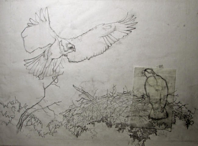
            You’ll notice that I’ve drawn two different views of the bird in flight. One is similar to the one in the photo, while the other is a bit more dramatic, with the wings outspread. I worked out 5 thumbnails in all and you can see them all here.
            Since the drawing is much different from the original photo, I decided I wanted the client to look at the sketches and also the two choices of the bird in flight to see how they coincided with her mental picture. Maybe she’ll be more happy with my more close up view of the birds – but maybe she is thinking more in terms of the photo view. I want her to be happy with the composition before I proceed. The pose of the bird is also important. She’ll let me know which bird she likes best. From there I’ll start to work out more details.
            Next week I’ll discuss the client’s reaction to my thumbnails and what view she prefers.