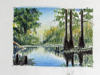
Work In Progress:
Suwanee River, Update 4
The Color Sketch
Pastels are
very liberating!
I did a color sketch for the
painting and, because I had a pretty good idea of what colors I wanted to use, (and
I know that I can easily add to them and perhaps replace some with others as I
progress) I produced only one color sketch.
Choice of colors, or more to the
point, making new colors, doesn’t have to be planned out as carefully with
pastels as with colored pencils. Pastels are nearly pure pigment, are opaque,
and can be layered one on top of another, one color effectively replacing another
color beneath it. That is difficult or impossible to do with colored pencil
(unless special techniques are employed). Colored pencil color is translucent
and layering one color on top of another results in an optical mixing of the
two. There is an enormous selection of hues, tints and shades with pastels, so
it is much easier to find the right color without having to mix it.
Although I want to use colors close
to those in the actual scene, matching them identically is not critical.
Getting the right value is most important, then getting a believable and pleasing
color comes next. So, here is the color sketch for the painting.
I will be doing an underpainting to
add variety and interest as well as help unify the painting. I’ll discuss that
next time.

No comments:
Post a Comment