Most of my nature paintings are
of scenes outside my home state of Florida, either in the Appalachians or other
far off, but equally appealing locales. However, there are some very beautiful
natural areas here in Florida and I decided it was time to do a painting of
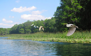
one. A few weeks ago I was looking through some photos I had taken while
boating on the Withlacoochee River. There were two that were appealing, but one
offered interesting reflections, perspective and depth, as well as a mix of trees
and grass that I liked. It looked like a good start.
The scene
was interesting, but I wanted I wanted to bring more life and motion into it.
What better way than to introduce some native birds – egrets. I found some
photos of egrets in flight on the web and downloaded a few in various flight
configurations. I then copied them and inserted them into the original photo,
moving them around and changing their sizes to see what patterns I could come
up with. I varied the sizes and positions of the birds to make the overall
composition more interesting. To introduce a focal point or
center of interest (COI), I greatly enlarged one of the birds and placed it
near one of the sweet spots – near the intersection of two lines that divide
the picture area into thirds both vertically and horizontally. One of the
compositions seemed promising.
Although
the latest compositions seemed to be getting closer to what I wanted, there
still seemed to be a problem. The converging lines of the trees and water, as
well as the line of birds, seemed to draw the eye off the painting to the left
side. Something was needed to stop the eye from passing off the painting. I
thought that a grouping of trees on the left would help. I looked online once
again for cabbage palms (sabal palmetto), one of the iconic trees of the
Florida wetlands. I found some and, again, downloaded the photos, and copied
them into the compositions I had settled on. I moved them around, altered their
sizes and proportions and fitted them near the left border. It seemed to
improve the composition.
I now have two compositions that
look pretty good. One shows the center of interest higher,
with the trees as backdrop. The other shows the
center of interest lower, with the wing breaking the line of the water. The
higher center of interest is near the middle of the photo vertically, the lower
center of interest is closer to the bottom third line – closer to the “sweet
spot”. It seems to improve the composition a bit more but there
still seems to be something a little off. The center of interest is now low
enough but seems to be a bit too far right – too close to the right edge. So, I
move the bird over left a little, nearer the converging lines one third of the
way up from the bottom and one third of the way in from the right. Ah, that
looks better. The center of interest looks a little bit too large,
so I make it just a little smaller. I like the change.
Now, I want to see how the values
look, so I convert the photo to black and white, then blur everything
to simplify the shapes, and deal mostly with values. Everything
seems good. The birds seem to show up well, the grouping of cabbage palms keeps
the eye from wandering off the picture, the birds are of different sizes and
configurations, as well as positions, and there is one bird set off by size and
position as a center of interest. That bird is near a “sweet spot” and its
white body contrasts sharply with the dark background. As a final manipulation,
I blur the color photo to simplify the colors. Once again, the birds show up
well, especially the center of interest, whose white color contrasts well with
the green background.
All I have to do now is develop a
color sketch so I know what colors and color combinations I’ll be using. I’ll
discuss that next time.


No comments:
Post a Comment